I began to sketch ideas of what the layout of the site would look like, as well as how the quiz would look. I wanted to feature 4 key pages: a home page with the quiz, a petfolio page that allows the user to read about any of the site's animals, an about page, and the animal pages themselves.
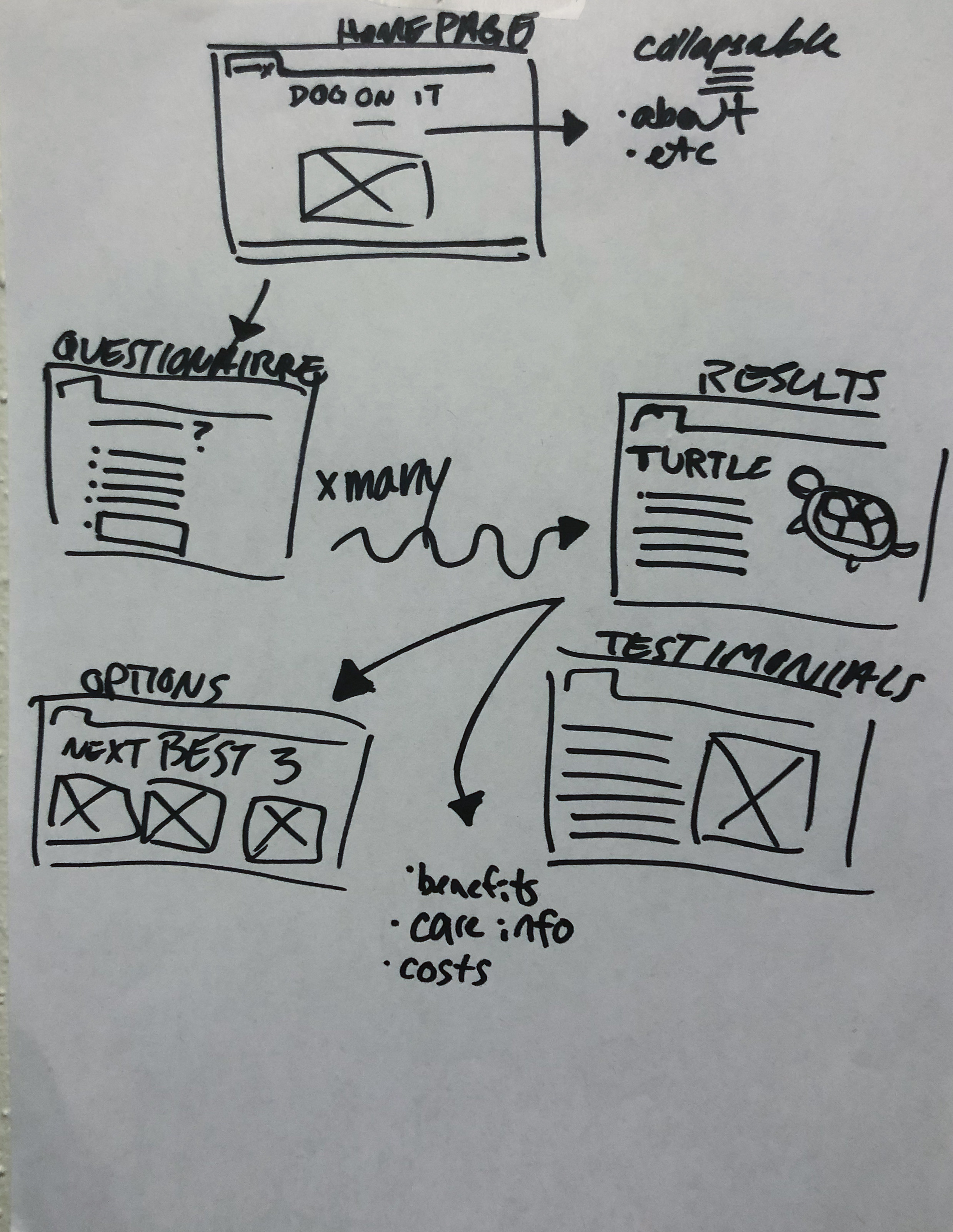
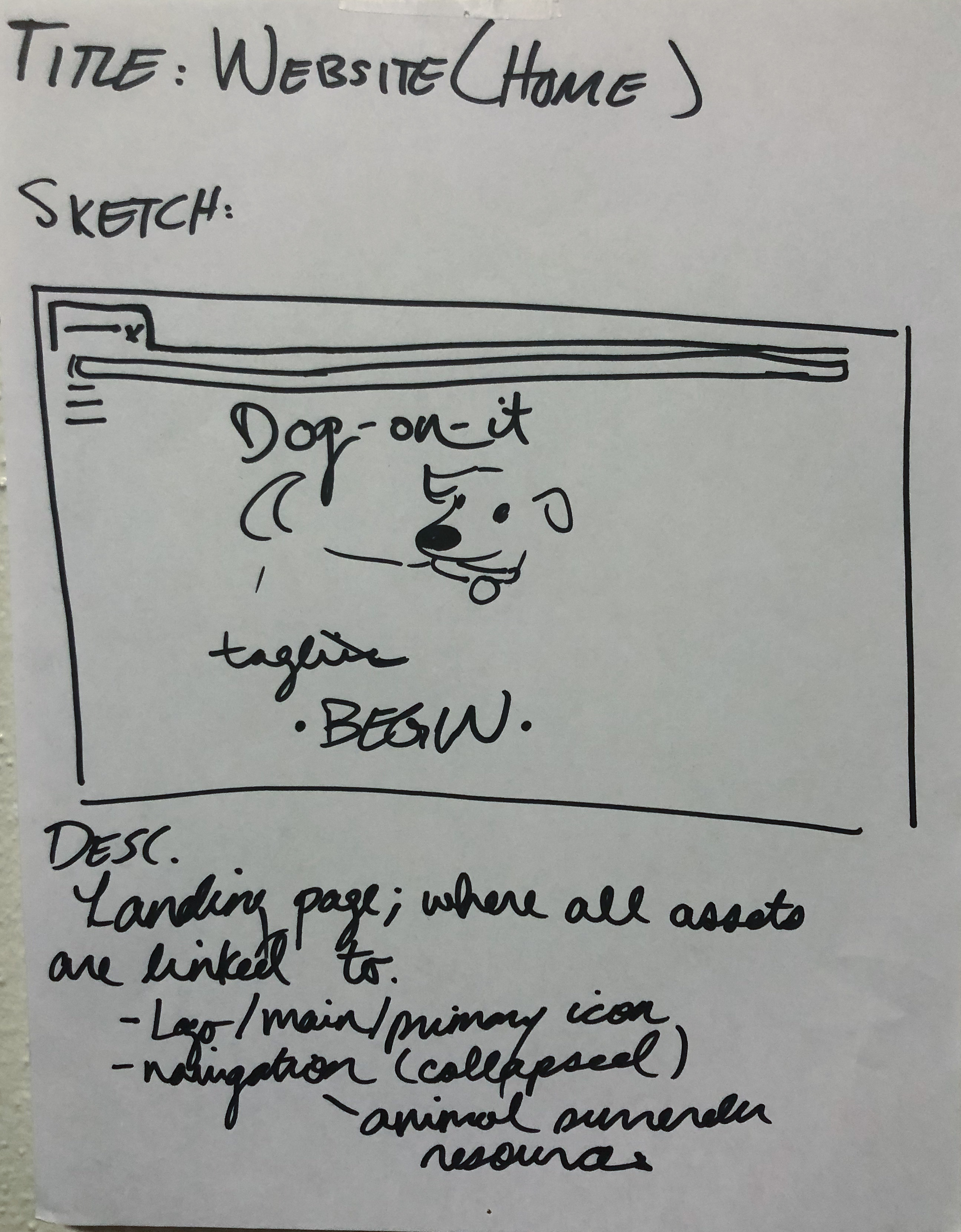
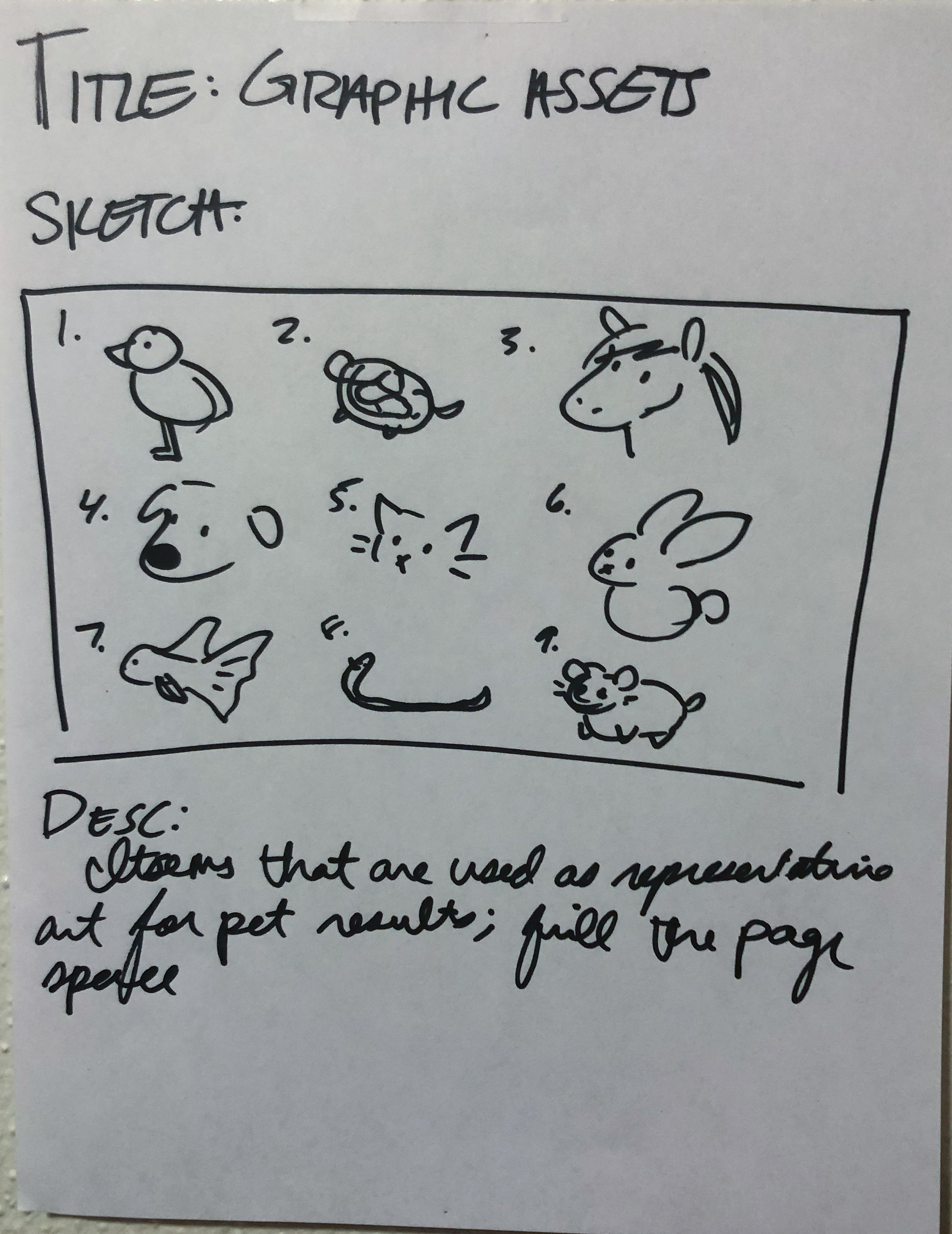
I began coding a possible solution, but found that it failed to look like contemporary web design and that it lacked a certain personality. It also was much too text heavy; I feared I would lose users if they were tasked with the chore of heavy reading. I scratched this layout and began to rethink for one that utilized more screen realty to be visually engaging.
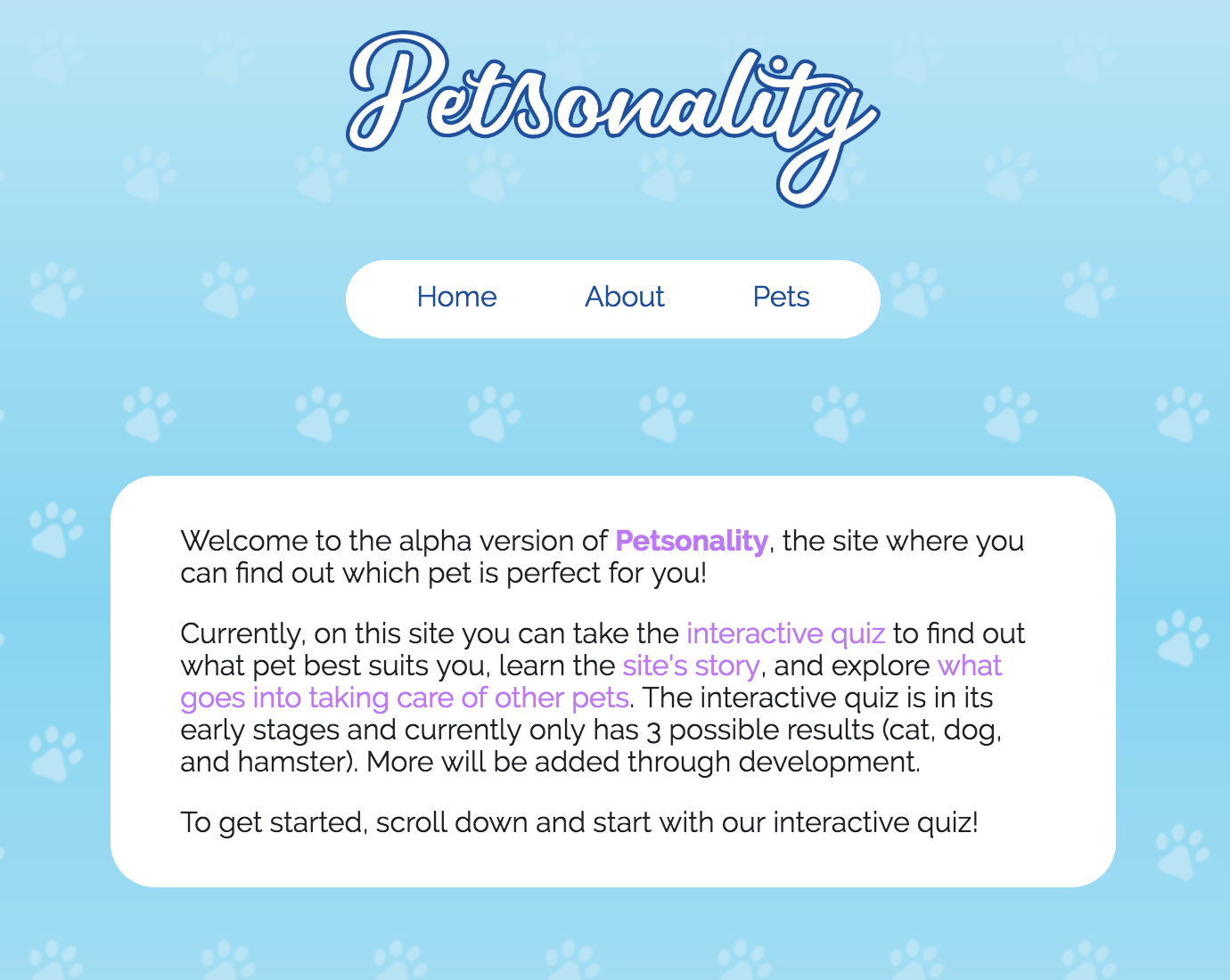
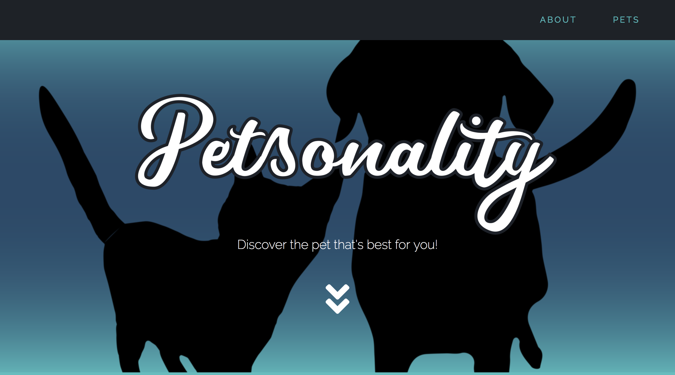
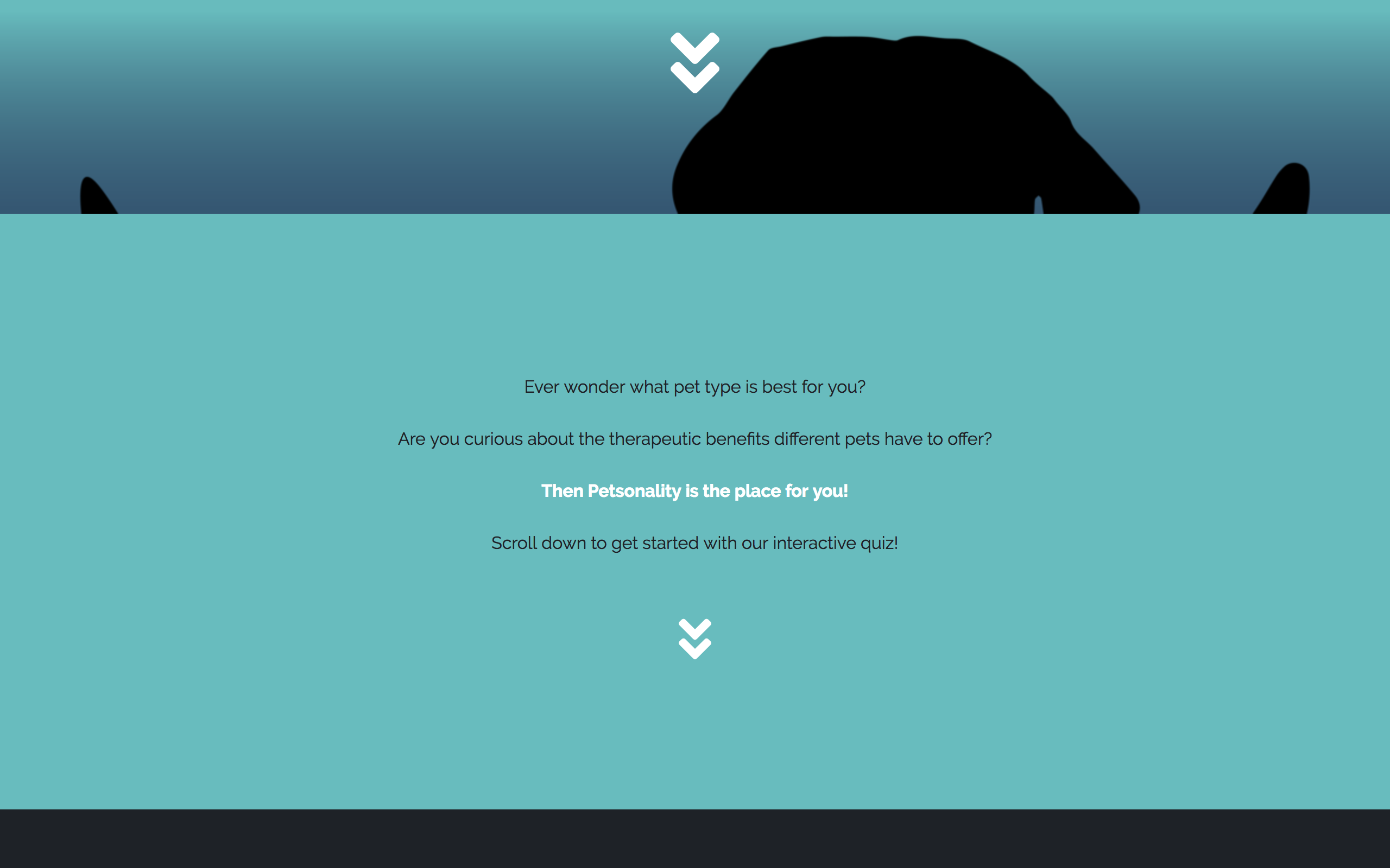
The next solution was one I felt much more comfortable with. For starters, the home page features a large image with the silhouettes of a cat and dog. This sets up the theme for how animals will be depicted on the site: through silhouettes. Silhouettes allow the user to recognize what the animal type is as well as not have to attribute a specific look, breed, or color to that animal.
Beneath the landing page image is a brief hello-statement to get the user interested in what the site has to offer. They may then proceed to the interactive quiz below. The quiz on the current website is an alpha version of the ideal quiz which would feature all 34 questions so the user will get the most accurate result.

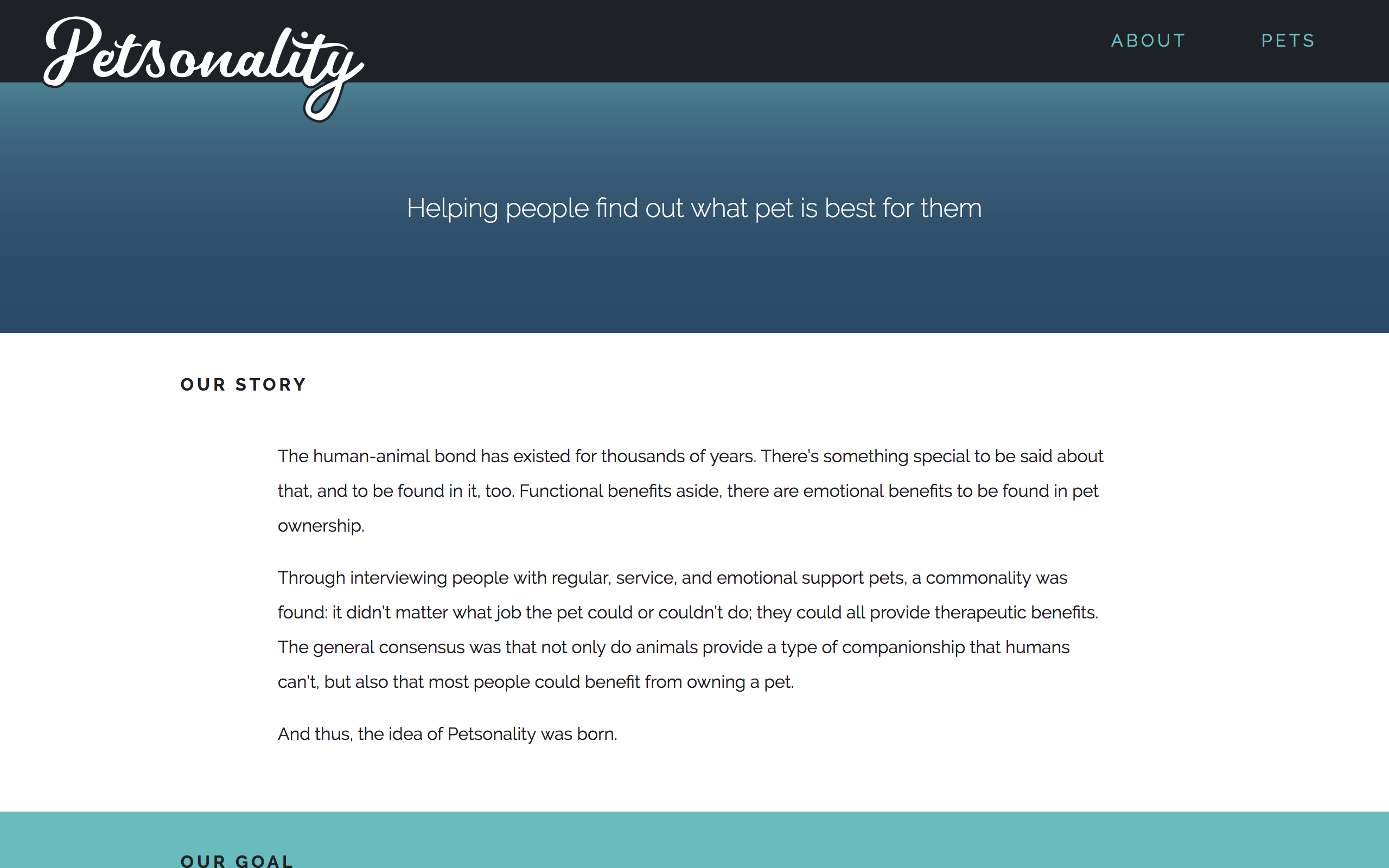
The about page is fairly simple; it serves 2 roles: state the mission and state the goal. Currently, the about page also lists the ideal variety of animal types to receive as possible results from the interactive quiz.
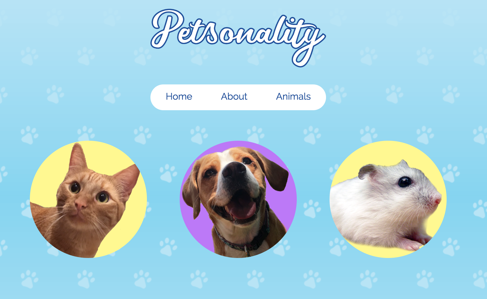
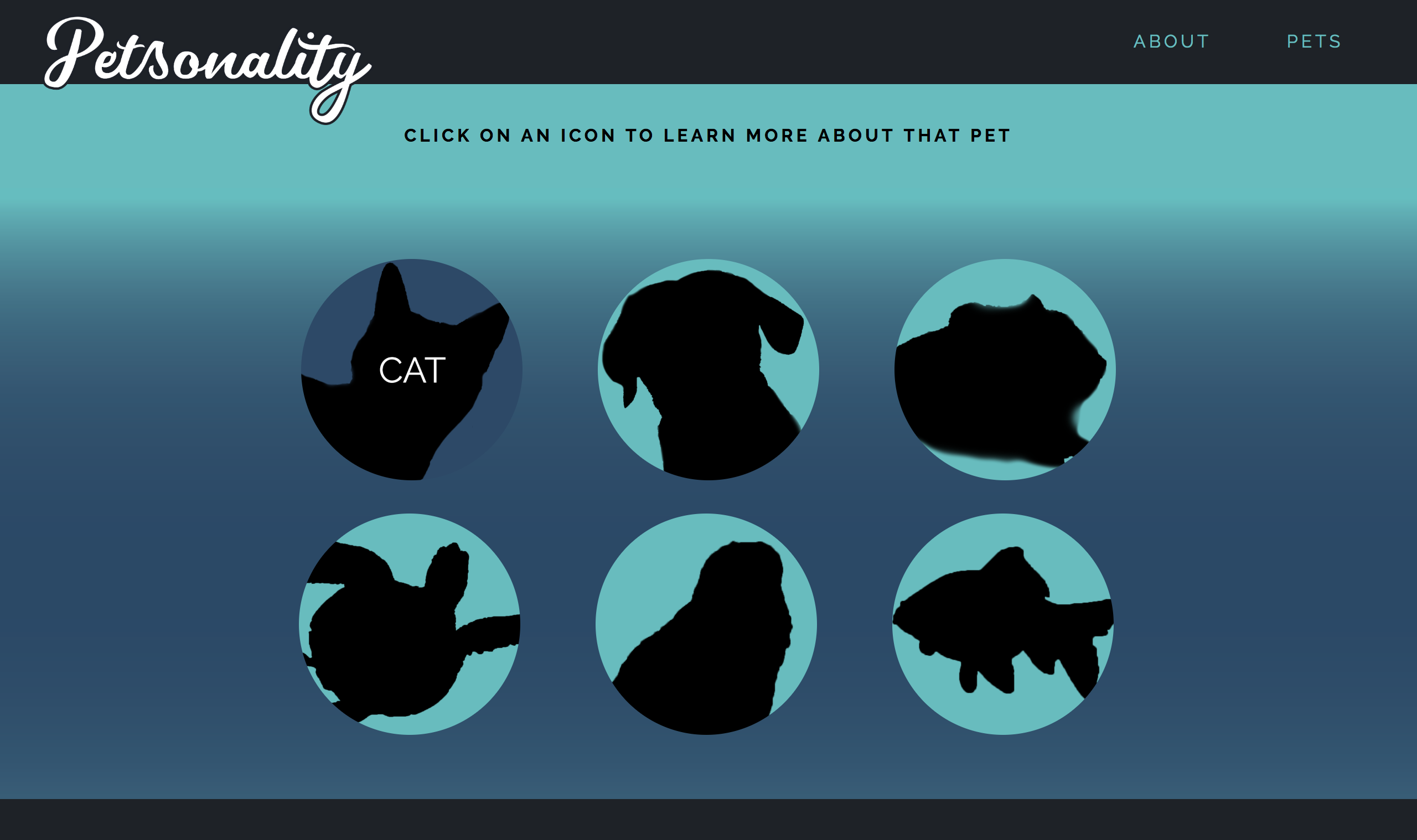
The petfolio page is a way for users to explore other animals if they aren't pleased with the result they got from the quiz. This way, they don't have to retake the quiz to get a new result; they can easily navigate to the petfolio and click a new animal.
The format of this page is simple: hover over a silhouette to read what animal it is, then click to jump to its page.
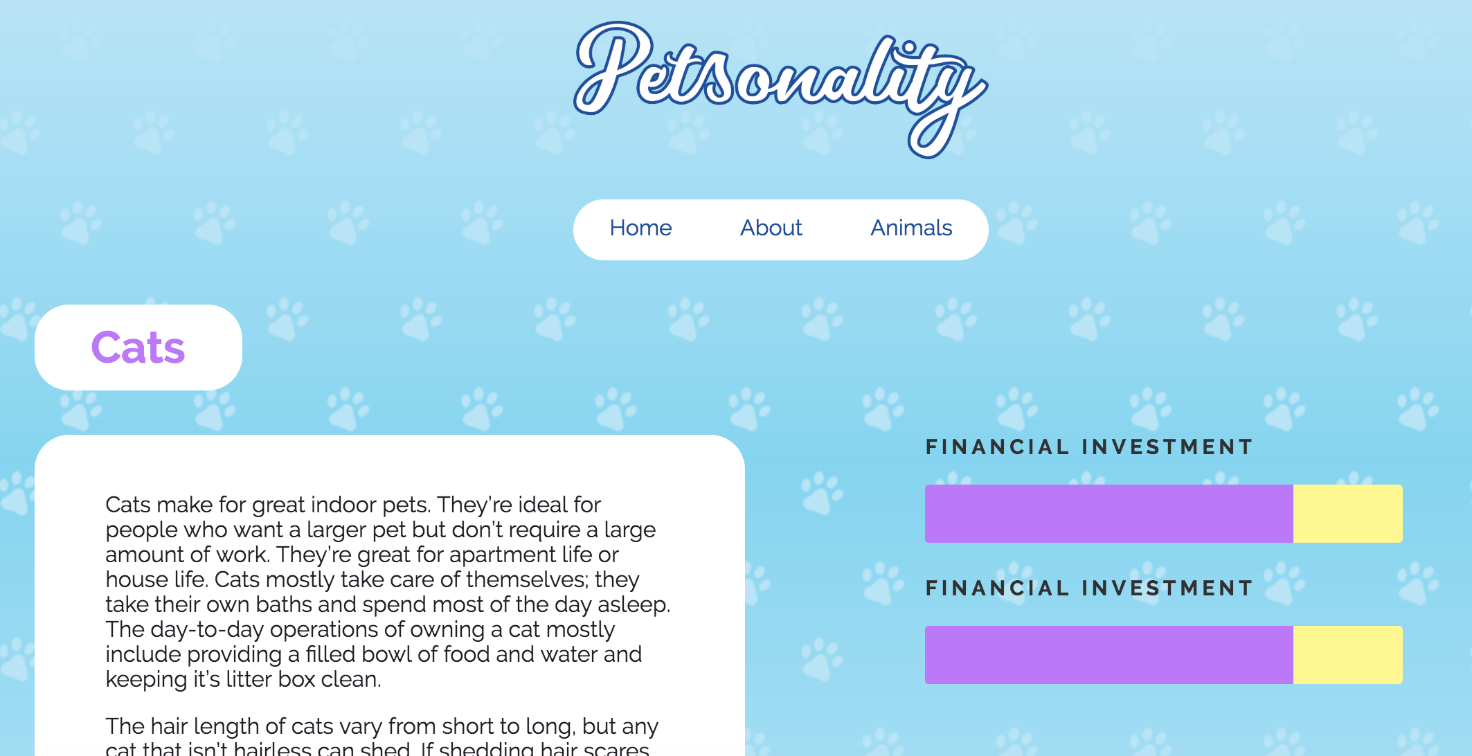
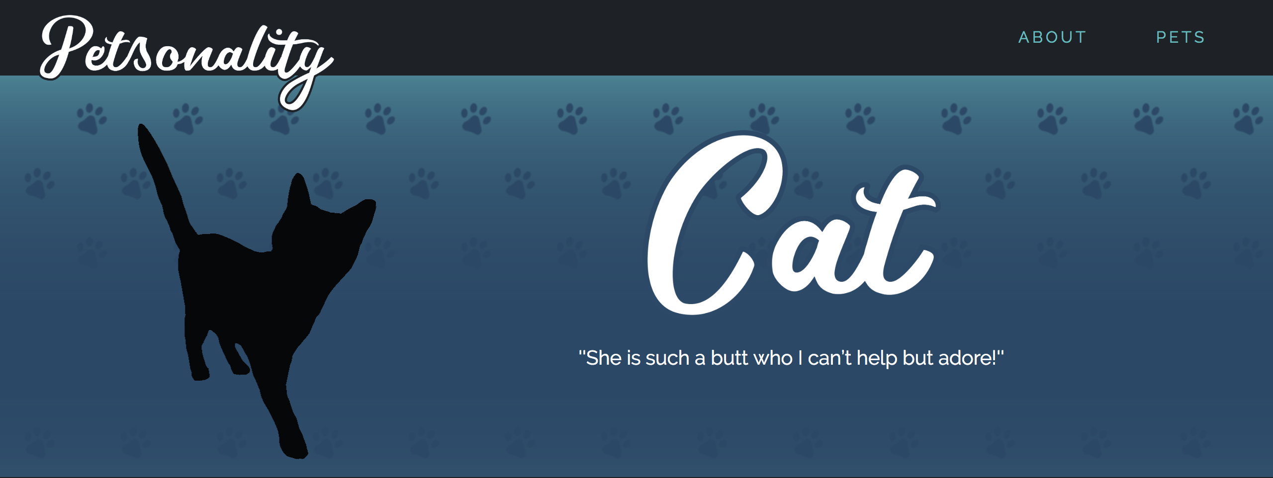
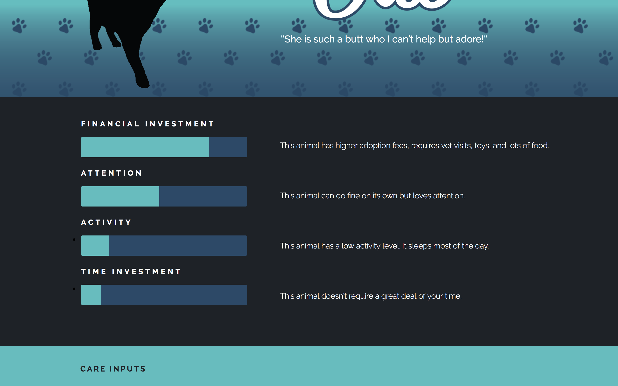
The final layout on the site is that which is on the pet type pages. The first thing the user is presented with is a simple animated gif of the animal's silhouette for some light visual engagement. To its right is the name of the animal followed by a quote from my interviews regarding the relationship between the owner and that pet.
Beneath this is a section illustrating via infographics the inputs of owning that pet in terms of financial investment, time, attention, and activity, and a brief sentence explaining the bar. Financial investment includes adoption fees, equipment costs, any vet visits, and cost of food.
The next section contains icons of the things mentioned above, like dry food, water, cages, tanks, and other care-related items needed to be purchased with ownership of the pet.
After these care inputs is the section for therapeutic benefits. This is the place on the site where I feature quotes from my interviews on what emotional benefits are tied to ownership of that pet. Many of my interviewees found their pets alleviated mental hardships, so this is the location to express that.
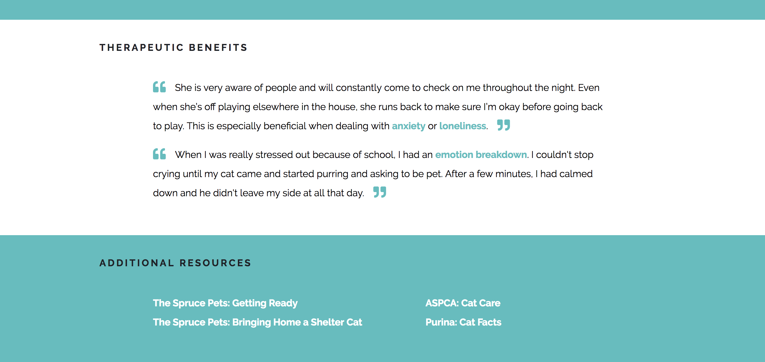
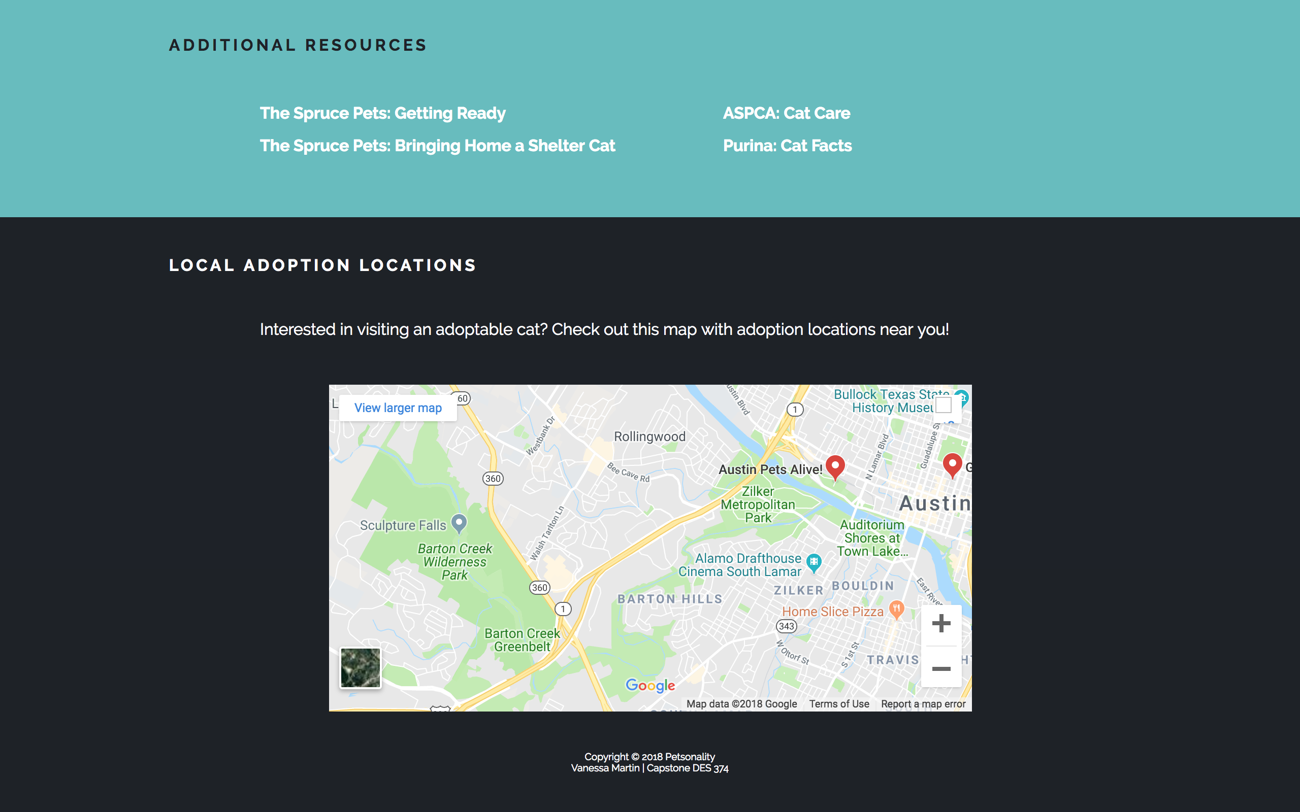
Next is the section on additional resources. Here is where external links are provided so the user can learn information about that pet in greater detail. It isn't Petsonality's job to explain every consideration in the ownership of that pet; it only intends to give you a general idea so that you have an idea of what owning that pet would be like after getting your result.
These links guide users to sources on how to get their home ready for that pet, what supplies are needed, what their personalities are like, and general care information.
The final section contains a Google Maps element so that users can see local animal adoption facilities. This way, users interested in taking the next step in the animal adoption process have an idea of where they can go nearby to visit some adoptable pets.
